25 POP Colour Design Painting Ideas
Painting your POP ceiling is a masterful way to inject colour and aesthetic beauty into your space. Check out these POP colour design painting ideas that will instantly transform and liven up any room.
POP stands for ‘Plaster of Paris’. It is a hard and durable dehydrated form of Gypsum used to construct false ceilings, walls, and even partitions in a room.
This plaster is smooth and moldable and can add an effortlessly modern feel to a space. There are a variety of ways to design POP ceilings with invigorating colours.
Replacing your stark white POP ceiling or structure with a fresh paint colour is an easy way to give your room a new facelift.
A painted ceiling adds a fun and character element to a space.
According to experts, the best paint to use for POP structures is flat latex paint as they do not fade away quickly.
In this article, we have curated 25 POP colour design painting ideas for creating a harmonious modern space.
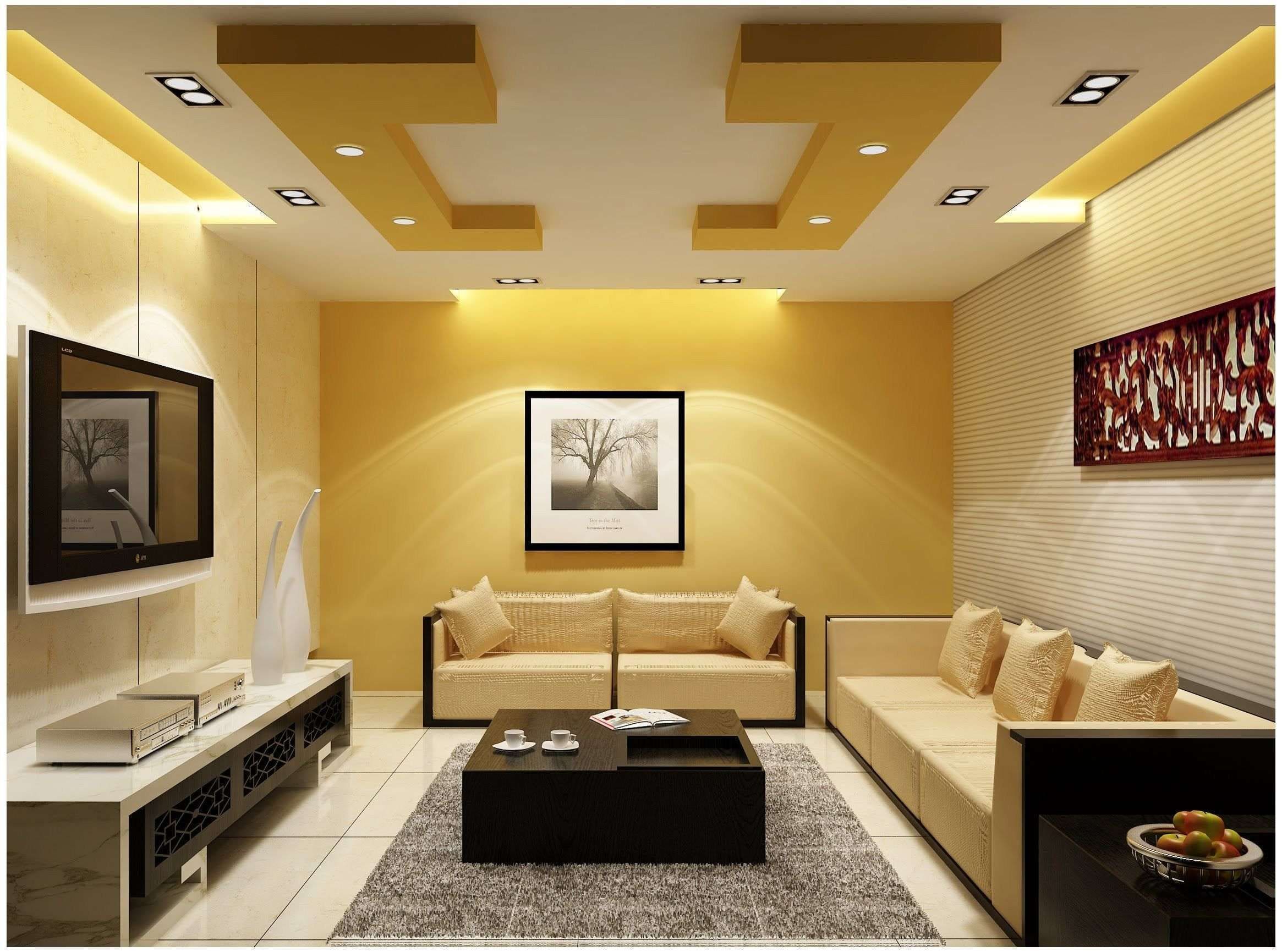
1. Yellow POP Design
Yellow is commonly used as an accent colour in interior design because it is a cheerful and mood-boosting hue.
It instantly adds warmth and brightens a room. If you’re considering a yellow accent wall for your space, then it makes aesthetic sense to paint a portion of a POP yellow the same colour.
Shades like buttercup, macaroons, Tuscan sun, and elegant mustards can add a relaxed, livable feel to your home when used for a false ceiling design.
2. Light Green POP Design
It’s no surprise that green is one of the most popular colours for interior spaces. Since it’s nature’s most associated colour, such designs add a refined sense of style, tranquility, and a soothing ambiance to a room.
Green is also one of the easiest colours on the spectrum to work with. Light green shades make a space feel fresh and bright while darker shades add moodiness and sophistication to a room.
3. Cerulean Blue POP Design
Choosing the right colour is key when designing a drawing room. Cerulean blue is a deep shade of blue that is great for introducing a dramatic flair to space.
Whether used as a primary colour on the scheme or as an accent colour, this hue is sure to infuse your space with a strong sense of style and elegance.
4. Peach POP Design
Peach is a delicate yet crowd-pleasing hue. A peach POP colour design painting can add a subtle and unique character to your space.
A lick of peach paint on a POP ceiling is a tried and tested way instantly bring life and serenity to an otherwise mundane space.
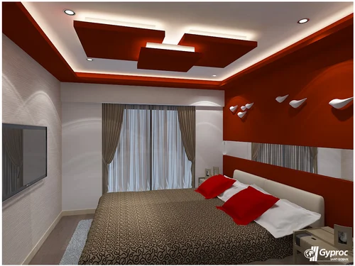
5. Red POP Design
Red is a bold and daring hue that is perfect for introducing drama and character to a room. There is a controversy about whether red is ideal for interior spaces.
This fiery hue can be too overwhelming for some spaces but for others, it makes the ultimate statement-making colour.
Although red tends to be the hardest primary colour to work with. So, use it in moderation for the best outcome.
6. Dark Blue and Light Green POP Design
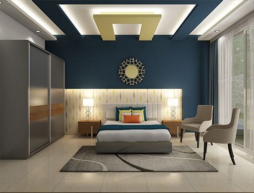
A dark blue and light green POP colour design painting can curate a statement-making design.
These pair are neighbours on the colour wheel and both are associated with nature, so they make a refreshing combination.
If you’re looking for stunning and captivating pop design colour schemes, dark blue and light green may be perfect for you. In addition, you can incorporate these colours into your home decor for cohesiveness.
7. Purple POP Design
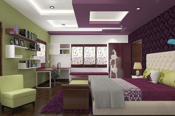
The colour purple is strongly associated with wealth, royalty, and opulence. Purple is an energetic and statement-making colour to introduce to your colour scheme.
It infuses warm and a sophisticated look into a room. The best colours that go well with purple are light green, pale yellow, blush pink, and creamy neutrals.
8. Purple and Yellow POP Design
Purple and yellow is an easy pair because they sit opposite each other on the colour wheel.
Contrast colours complement each other beautifully. This two-colour combination for bedroom walls can add a major statement to your room’s POP.

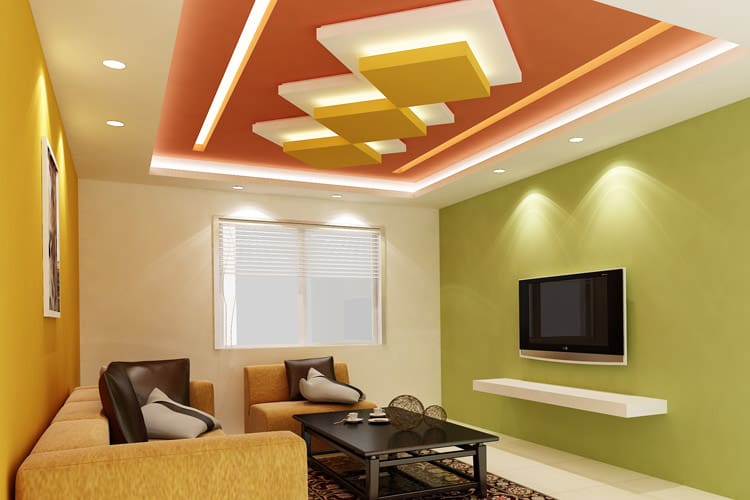
9. Yellow and Salmon POP Design
The yellow and salmon colour combination introduces a fun and playful element to a room.
If you’re looking for something unusual yet eye-catching and bright, then this pair should be on your radar. POP ceiling designs like this bring a ray of sunshine to your home. For a harmonious look, use wall colour combinations to complement the POP color scheme
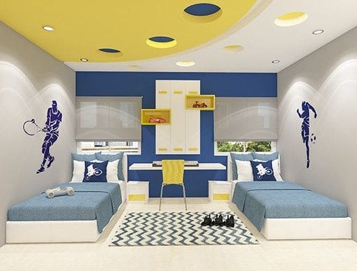
10. Yellow and Blue POP Design
In interior design, blue and yellow go well together like avocado and toast. These pair painted on a POP ceiling can bring a sense of warmth and tranquility to a room.
Blue is quite easy to work with and so is yellow color. The key to nailing this style is choosing to right tones to suit your aesthetic preferences but also create an elegant look. This may be one of the best pop colour combination for kids’ room.
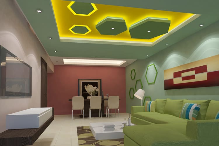
11. Green and Yellow POP Design
In the colour wheel, green and yellow sit closely beside each other so are like are subtlety striking pair. Yellow is reminiscent of the sun while green reminds us of nature.
Dark shades of yellow such as mustard, ochre, and honey will complement light greens of green such as fern, basil, and pastel— and vice versa.
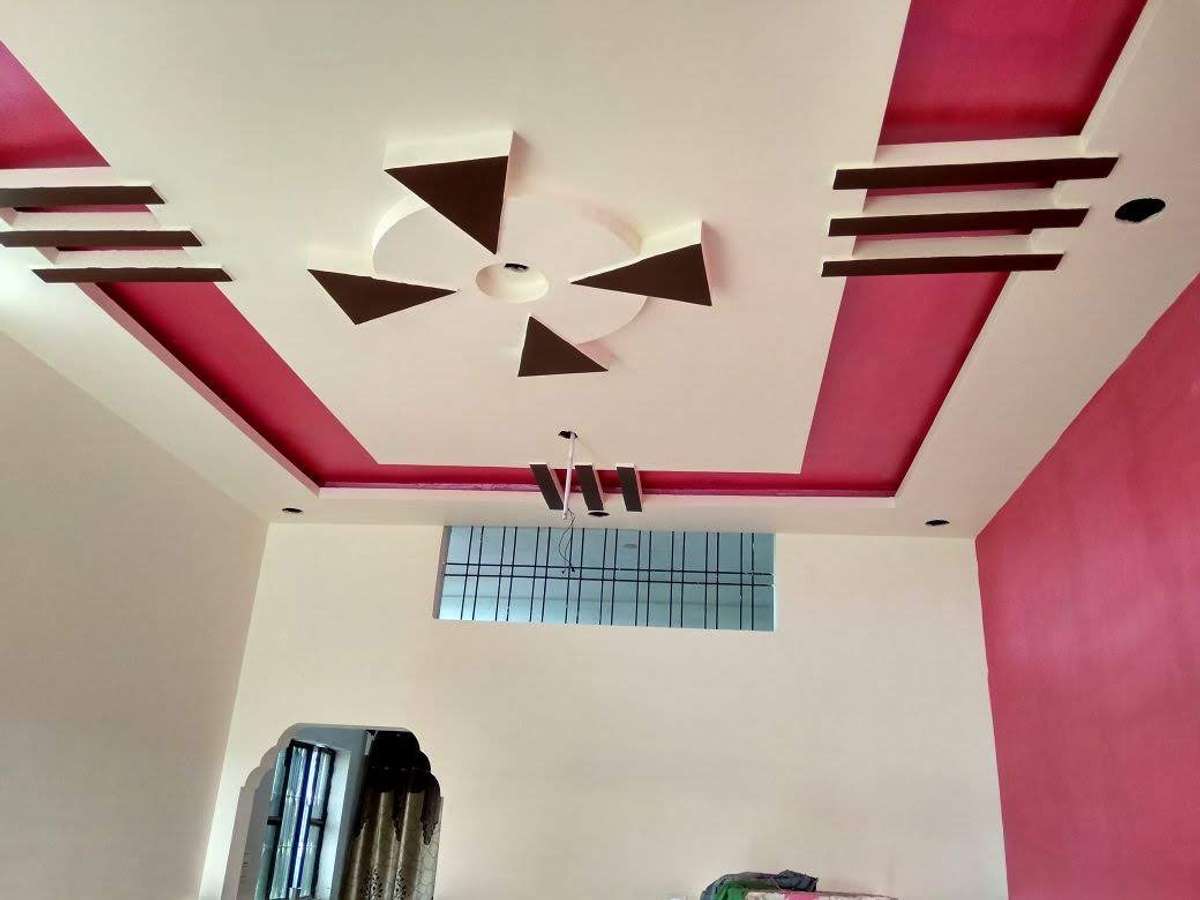
12. Pink POP Design
Pink is a very versatile hue that adds delicacy and freshness to a room.
It exudes feminine energy but when used in paler tones or combined with masculine hues like navy blue, black, charcoal grey, and brown, it can create a refreshing contemporary space.
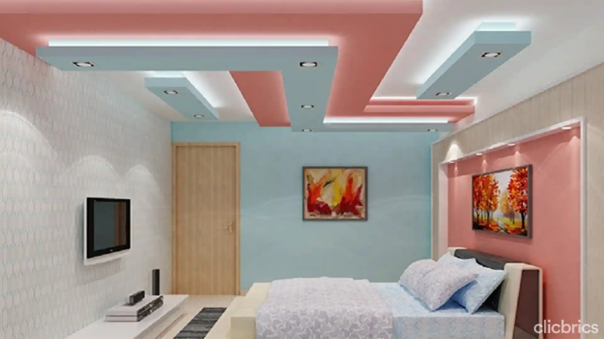
13. Blush Pink and Pastel Blue POP Design
The blush pink or pale pink and pastel blue POP colour design painting is probably the most delicate pair that can instantly make your room feel fresh and airy.
It is a superb tow colour combination for creating a soothing ambiance in a room.
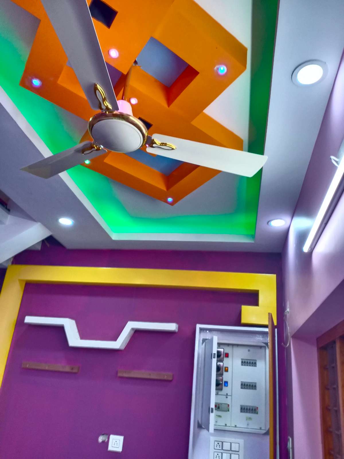
14. Orange and Green POP Design
Orange and green are an eye-catchy combination that is perfect for a dramatic look. If you’re a little colour shy or want a more subtle approach, use a paler tone or green or orange paired against a darker tone of the other.
There are an array of POP colour design painting ideas, but the key is choosing the right shades that work brilliantly for your space.
Pops of color are great for drawing the eye up and adding a dramatic flair to the overall look of your space. This is a false ceiling design perfect idea for kids’ room.
15. Light Grey POP Design
Light grey is one of the most popular neutrals used in interior design for a good reason. It is ideal for a clean, modern, and minimalistic design.
If you already have grey as your colour scheme, consider painting a portion of your POP grey as well to create a visually appealing and cohesive look.
Consider incorporating geometric patterns or floral patterns into your design as this can add more character to the entire room. A statement light fixture can enliven a neutral false ceiling. Grey and white one of the most popular color combinations for POP ceilings.
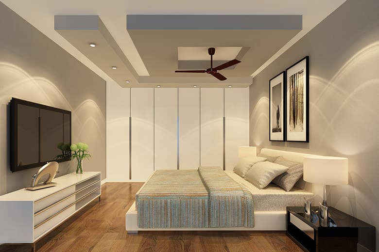
16. Yellow and Dark Grey POP Design
Injecting some yellow on a POP ceiling makes a space pop like never before.
It draws the eyes up and creates a focal point for the room. Dark grey is an ideal pair for toning down the yellow. This pop of color is a great way to enliven a humdrum living room.
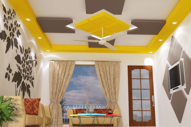
17. Dark Cyan Blue POP Design
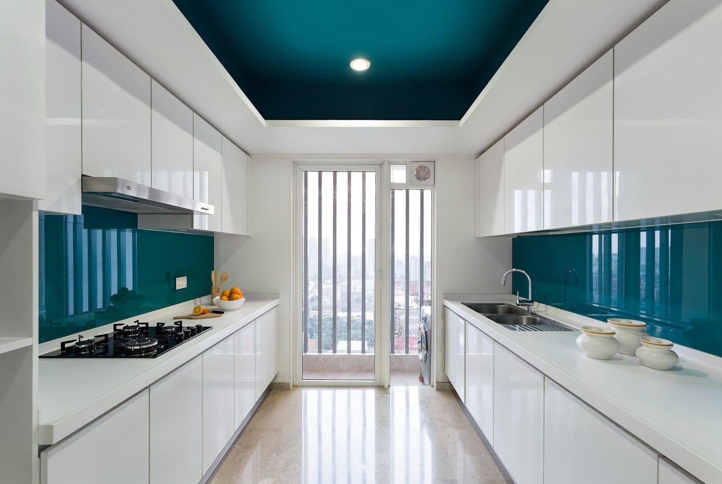
A dark cyan-blue POP colour design painting will work well in the living space and in just about any room in the home.
For an instant touch of drama, sophistication, and timeless elegance, look no further than dark cyan blue. Dark colours are particularly great for creating a moody and cozy space.
18. Red and Blue POP Design
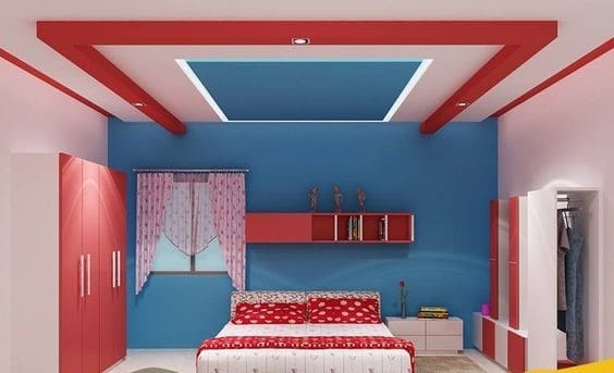
A red and blue two colour combination infuses a high dose of drama and character into a room.
This combination may be too overwhelming for spaces like the bedroom, but they can create an interesting and unique design.
So, if you’re design-savvy and they appeal to you, go for it! Since this is a dramatic false ceiling color combination, the wall paintings are best being plain white walls.
On the flip side, white ceilings work great with bold colors or a simple ceiling design.
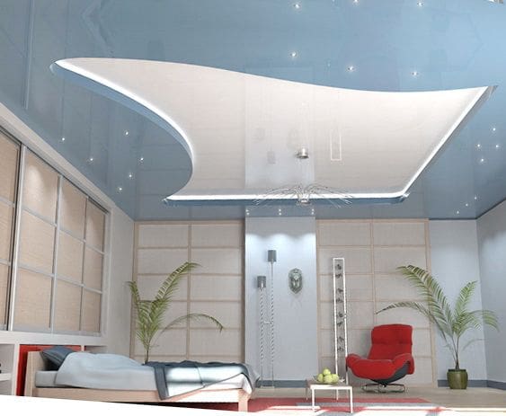
19. Light Blue POP Design
Light blue is a calming and refreshing hue that is incredibly easy to work with. It radiates subtle elegance and sophistication.
Looking for a POP colour design painting that will make your room fresh rather than kitschy? If so, then light blue may be a good option for you. Various shades of blue can give different finished looks and feel.
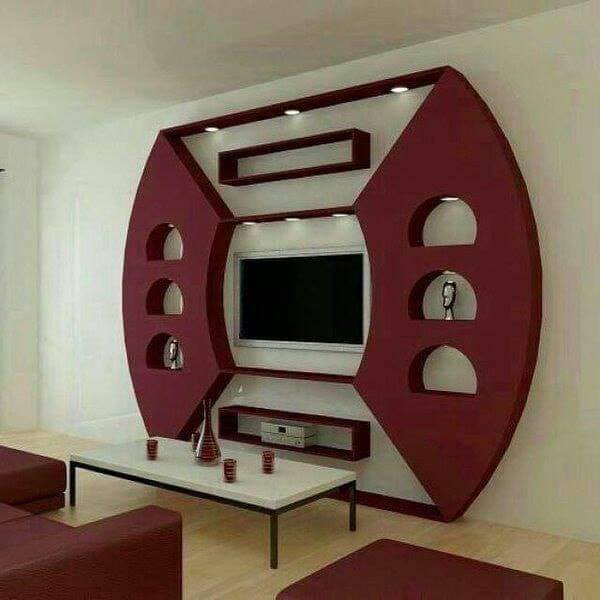
20. Burgundy POP Design
Burgundy is an enticing and warm hue that is derived from a mixture of red and brown. It is used to draw attention to an area in a room.
Often associated with power and wealth, burgundy is considered to be a timeless, sophisticated, and alluring colour.
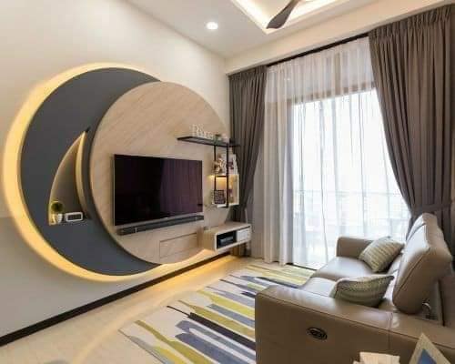
21. Navy Blue and Beige Grey POP Design
The navy blue and beige combination is a match made in interior design heaven. Simply put, it is a perfect duo of laid-back elegance.
If you want your POP to stand out in a sophisticated and less intrusive way, then the navy blue and beige combination is the way to go.
22. Orange POP Design
Painting your POP orange is an excellent way to add some aesthetic flair and breathe life into your home.
If orange sounds too intimidating, consider using pale or brown shades of orange. 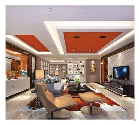
23. Magenta POP Design
Magenta is a sophisticated blend of purple and pink. This timeless hue can instantly take a space from basic to luxurious.
Remember, there is no perfect no POP colour design painting. The colour or shade you oft for should complement the colour scheme of the room for a cohesive look. Gather some creative ideas and add your twist to it.

24. Yellow and Light Grey POP Design
Grey has proved itself to be an enduring neutral and yellow a striking hue. Yellow and light grey POP colour design painting is an effortlessly visually appealing combination.
This duo can make a real style statement and infuse warmth and a refined sense of style into the space.

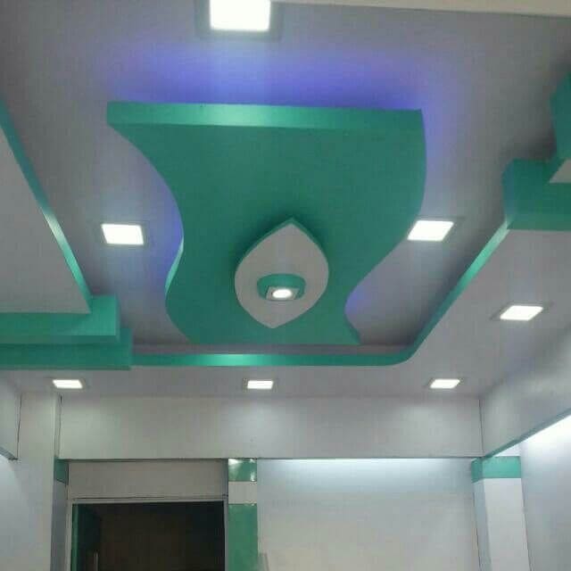
25. Turquoise POP Design
Turquoise POP colour design painting is great for making a statement and drawing attention to the POP.
This sea-like hue can help to bring brighten up and bring tranquility to a space.
