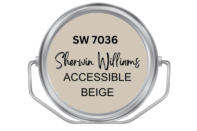
Accessible Beige Sherwin Williams SW7036 Review (With Real Photos)
Beige is favored in contemporary interior design for its earthy appearance and calming effect. Are you wondering if the popular ‘Accessible Beige’ is the right color for your home?
Here, you find out all you need to know about Sherwin Williams Accessible Beige.
The color scheme can make or break any design project. The right use of color can instantly take a room from boring to aesthetically pleasing. It is crucial to get this right!
Beige is the dominant neutral color used for interior walls over the past few years.
Most people find it to be a warm alternative to stark white which can appear cold and offputting.
The Sherwin Williams Accessible Beige paint is not quite like other beige paint.
This beige has a grayish undertone which allows it to be classified as a greige color.
It is a must-have if you want to infuse warmth and coziness into a minimalist interior.
Although this eye-catching shade of beige works brilliantly for both interior and exterior walls.
In this article, we will be answering all the questions you may have about Accessible Beige and sharing photos of what it looks like in real-life interior and exterior spaces.

Accessible Beige Stats
● Sherwin Williams Accessible Beige – 7036
● Hex Color Code- #D1C7B8
● RGB Color Code- (209, 199, 185)
● CMYK Values- 0.0%, 4.8%, 12.0%, 18.0%
● Pantone / PMS 13-0404 TPG / Ancient Scroll
● Family- Beige/Gray
● LRV – 58
What are the undertones of Accessible Beige?
Just like other neutrals on the color spectrum, Accessible Beige has an undertone.
Most beige colors have a yellow undertone but Accessible beige has a beige, gray, and a tinge of green undertone.
 (Real Sherwin Williams Accessible Beige Paint) PHOTO CREDIT: JESSICA AKEMON
Where is the best place to use Sherwin Williams Accessible Beige?
The Accessible Beige is overwhelmingly popular not just for its ability to make a home feel fresh and modern but also because it can be used in any room in the house and on exterior walls as well.
Plus, this invigorating color can also be used on both outdoor and indoor furniture and trims.
 (Real Sherwin Williams Accessible Beige Paint) PHOTO: INSTAGRAM @FARMVIEWFORTWO
Accessible Beige vs Balanced Beige
The Sherwin Williams Balanced Beige (SW 7037) is another visually impressive shade of beige that can give both interior and exterior walls a serene and contemporary flair.
Balanced Beige strikes the perfect balance between warm and cool tones.
According to color experts at Sherwin Williams, it is best to pair it with refreshing shades of white like Alabaster (SW 7008 )or Aesthetic White (SW 7035).
What is the difference between Accessible Beige and Balanced beige?
These colors pair have some similarities but are vastly different. Accessible Beige is a light warm color while balanced beige has a medium-dark hue and is considered a taupe rather than beige.
There is more subtlety and paleness in Accessible Beige compared to Balanced Beige. They can serve similar purposes, so none of better than the other.
As mentioned earlier, AB has a gray-green undertone while balanced beige has a brown and deep warm red undertone.
Accessible Beige is, however, the most popular beige color.

Accessible Beige vs Agreeable Gray
Sherwin Williams Agreeable Gray (SW 7029) is sometimes confused with the Accessible Beige. Let’s clear up the differences!
Just as the name implies, Agreeable Gray is a color that belongs to the gray family.
The color is favored for its soothing and refreshing effect. In fact, it is Sherwin Williams’s best-selling color.
This timeless neutral is also interior designers’ go-to because it is easy to work with.
What is the difference between Accessible Beige and Agreeable Gray? AB is the warmer option- although AG also has a subtle warmth because of its beige undertone.
With an LRV is 58, AG is a soft warm gray paint that provides a refreshing backdrop for both modern and traditional interior and exterior spaces.
The only way to pick between these two is to decide whether you want a painting with a more beige or gray undertone.

Is Sherwin Williams Accessible Beige a Warm or Cool Color?
The Sherwin Williams Accessible Beige (SW 7036) is a warm color, despite its gray undertone.
 (Real Accessible Beige Kitchen Cabinet) PHOTO: RENOVATION HUSBANDS
 PHOTO: RENOVATION HUSBANDS
What Benjamin Moore Color is Closest to Accessible Beige?
Accessible beige is quite similar to Benjamin Moore’s Revere Pewter (HG 172) and Edgecomb Gray (HC 173) but how do they compare?
The crowd-pleasing Revere Pewter is a versatile shade of grey that strikes the perfect balance between warm and cool tones.
This stunning hue has gray and green undertones.
On the other hand, the magnificent Edgecombe grey has a greige and light undertone.
What makes these Benjamin Moore’s colors great alternatives to Sherwin Williams Accessible Beige is that they are warm greige with similar undertones.

 (Real Benjamin Moore’s Revere Pewter Paint) PHOTO: JOHN BESSLER
What Colors go with Accessible Beige?
A clever color combination is crucial in any design project. The best colors Sherwin Williams that go with Accessible Beige are:
- Tony Taupe (7038)
- Aesthetic White (SW 7035)
- Cadet (SW 9134)
- Woven Wicker (SW9104)
- Stardew (SW 9138)
- Coastal Plain (SW 6192)

This well-crafted playhouse by Project Hammer shows what the Accessible Beige looks like when used on outdoor furniture, shed, and exterior walls.
The project combines SW7036 and white paint in the trim and fencing.
 (Real Sherwin Williams Accessible Beige Paint) PHOTO: INSTAGRAM @PROJECT.HAMMER
Save Image to Pinterest


